
Whether you were taught about it in elementary school, or learned about it in high school art class, you probably have, in your mind, at least a vague picture of the color wheel. Colors that occur opposite each other on the color wheel are called complementary colors , and are said to be especially dynamic together, because they contain the entire spectrum of light. So if you want a color to really zing, pair it with its complement.
Quick note: the complementary color pairs explored here are based on the red-yellow-blue color model, which is one model of a subtractive color wheel . If you start with cyan, magenta, and yellow as your primary colors, or you choose to go with an additive color model , you’ll get slightly different complements. More on that here .
Blue & Orange
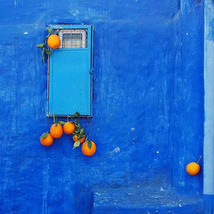
It’s not a room, but this photo (from Lucy Laucht, via her Instagram ) is one of my favorite photos of blue + orange together, and a great lead-in to this post. Don’t those oranges just jump out to you from the cobalt background? Aren’t they just the orangest oranges you’ve ever seen?
From Inside Out , here’s the same combo, but with a slight shift in the hues. This blue moves towards aqua, but still the orange blanket feels especially dynamic, even electric.
In this photo from Yatzer , an orange shell chair glows against a dusty blue background.
In this photo from Domino , the blue of the walls is much more subtle, but the orange accents still feel especially dynamic.
→ Killer Color Palettes To Try if You Love Blue
Purple & Yellow
Purple and yellow is, in my opinion, the trickiest of these color combinations to make work. Using both colors in very saturated tones can feel a bit elementary, but in this space from the Curated Interior , a mustard pillow perched atop a deep purple velvet couch feels just right.
In this bedroom from Trendspanarna , a mustard throw pairs beautifully with a light purple bedspread. The only color in the room comes from these two items, but the space still feels plenty dynamic.
This room designed by Wesley Moon does feature quite saturated purple and yellow tones, but these are balanced out a bit by the light blue walls and the muted red of the rug.
In this room from Elle Decoration , the purple Togo chairs and neon yellow poster set up an exciting interplay.
→ 6 Ideas for Colors to Pair with Purple
→ Here Comes the Sun: 5 Happy Palettes Where Yellow is the Star
Red & Green
I happen to think red and green look fantastic together, but this combination is problematic because, well, it makes people think of Christmas, and you probably don’t want your home to look like one of those year-round Christmas stores (unless you do, which, more power to you). The secret to making red and green work is to only use it in small doses, or to veer slightly away from the expected tones for one of the two colors. Or you can add lots of black and white to the mix, like in this room from House of Honey , where a red bench provides a delightful accent.
Black, white and gold, always a lovely combo, get a colorful boost from the addition of red and green accents in this dining room spotted on Milk Magazine .
In this room from Lonny , the bright red curtains pair beautifully with the bedspread, a Matisse-esque print in black and a slightly desaturated green.
Red and a light, almost olive green make a color combo that defies expectations, but still pleases the eye, in this bedroom from The Hunted Interior .
→ Awesome Color Palettes to Try if You Love The Color Green