The views from New York's largest private outdoor terrace, slightly wind-whipped and 17 stories high, sweep up and down Greenwich Street, across the Hudson River skyline, and hover above the September 11 Memorial & Museum plaza. Or "piazza," as architect Richard Rogers thinks of the ground level space below 3 World Trade Center , the 80-story, mixed-use tower designed by his London-based firm, Rogers Stirk Harbour + Partners. Opening today on its downtown campus (bought by Silverstein Properties a few months before the September 11, 2001 attacks), the commercial building features a largely column-free interior, a triple-height lobby, and private terraces on floors 17, 60, and 76. But, it's the public-facing amenities that set the glass-clad, steel-exoskeleton tower in its park. Levels of ground floor and below-ground retail, connection to 12 train lines via the adjacent Oculus transportation hub by Santiago Calatrava , and an interplay of light and shadow in the exterior pedestrian walkways, Rogers hopes it will soon become a "people's place."

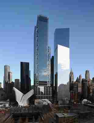
3 World Trade Center (at center) is flanked by Santiago Calatrava's Oculus transportation hub (left) and Fumihiko Maki's 4 World Trade Center (right) in the downtown campus.
Architectural Digest: When you started in the competition in 2006, how did your firm approach the design of this tower on a site that was essentially still rubble?
Richard Rogers: We knew ultimately where things were going to go. The competition had been won by Daniel Libeskind , and we followed it pretty tightly, all those that participated in the competition. Our building is more facing west across the open public space, which is in some ways the most important thing. You have this big public space [the September 11 Memorial & Museum] that, obviously, millions of people are coming to every day, both for historical reasons and reasons of the present and future.
AD: Knowing that the tower would overlook this public space, did you design to interface with it, or did you imagine 3 World Trade as a separate entity?
RR: It’s very much the outcome of the siting, the site itself, and also of the massing, which was given to us as part of the competition. But what we did was positioned it on axis, facing west, cross to the Hudson River and obviously to the east side, and the main road. I’m delighted to see that at the moment, the main roads surrounding are now closed and being used for pedestrians, which I think is their optimized state. And it’s next to, of course, the [Oculus] transport interchange, which gives it a tremendously powerful position and anchors it to that part of the site.

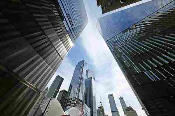
A view of the new tower from the ground.
AD: How about the aesthetic relationship between it and other buildings on the site?
RR: Yes, we still don’t quite know what’s going to happen with Tower 2, but we’ve now seen what Fumihiko Maki has done with his tower, which is, of course, very beautiful and pure glass sheers. We saw what SOM has done with Tower 1, the tallest one. We sit in between those, in the middle and looking across the memorial plaza to a public people’s place. And I’m very keen on the people’s place. I’m actually Italian, so "piazza" to me has a very important meaning within the social mix of the people.
AD: Let’s talk about the exterior structure to create a column-free interior. Why was that important?
RR: Internally, the fewer columns you have, the more flexibility you have and of course, change is a key part. In London, 50 percent of all the buildings in our Wall Street have been totally changed in the last 40 years. You have to make change possible, otherwise people will soon be demolishing the building. And, of course, long life is highly sustainable, sustainability being a keyword in this period of history.
AD: Is that how you would approach all commercial buildings today? Do you think those are the workplace requirements?
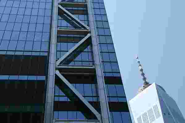
RR: Yes, I think today, what we’re learning is that nothing is constant. Change is inevitable and buildings have to make allowances for that change if they are going to have sustainable positions in the society that they are built for. The other part is that the building and the exposed structure on the corners, we are very interested in making what we call legibility to buildings. In other words, you can understand as much as possible how the building is actually built, how it can be made to stand, its light and shadow, how you can make a building which looks elegant and, in this situation, stretches up to the sky, all encouraged by the structure on the exterior parts rather than a glass sheet.

A detail of the exterior steel structure, which helps to render the building nearly column-free on its interior.
One of the great magics that Maki brings to a building is to try and minimize it by showing very little about the structure and letting the glass cover it. We’ve done, in some ways, the opposite. We are trying to create a sense of transparency. It’s the structure that’s giving you that. And that’s the magic of the building. That structure gives you a feeling of transparency. You have the play of light and shadow, you’ll have a number of different elements that your eye can follow throughout the building if you want to understand how it stands up. That’s your Gothic structure, of course this is not Gothic, but in a sense it’s the same thing. That’s what they did with the earlier century; they celebrate the structure.
AD: What do you consider exceptional about this building?
RR: It’s that it’s a public space. Its public space is exceptional. You usually take one building and it’s crowned with other buildings all around. Here, you’re standing in a park, and you’re pretty central in the park. And the views out will be quite stunning. The next exceptional thing is the play between flat surfaces against glass, and we had plenty of that, too, and structure, which is a legibility of how the building stands up.
AD: You’ve created a tower in a park, but the park existed first.
RR: Exactly.
