OMA New York is celebrating a first. Shockingly, perhaps, as the architecture firm established its office in the city in 2001, but on a rainy day last week, partner Shohei Shigematsu led a small group of journalists around the recently completed 121 East 22nd, a residential complex in the Gramercy neighborhood that marks the firm’s first ground-up building in New York City.

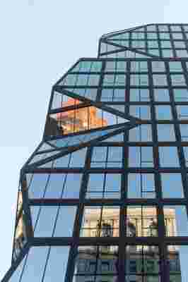
The jagged corner references Cubist geometries, a nod to 121 East 22nd's split identity between Gramercy and Madison Square parks.
It’s not that the firm has not been prolific, but its projects thus far have been interior fit-outs and renovations, explains Shigematsu to AD, referencing the Sotheby's New York galleries he redesigned, which opened to the public a few weeks ago on Manhattan’s Upper East Side. In Greenpoint, Brooklyn, construction is soon beginning on Greenpoint Landing, two towers on the waterfront that will likely be OMA New York City’s second ground-up residential project. And details are pending on its concept for the New Museum expansion, which will create an addition adjacent to the SAANA-designed structure completed in 2007 on the Bowery.

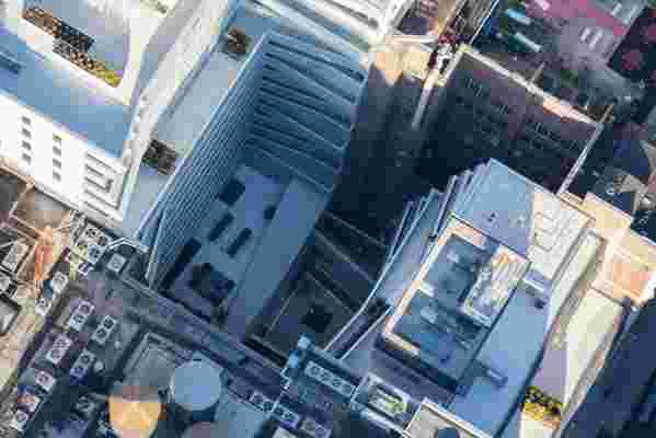
OMA designed a required light well as an exterior extension of the pool and gym at the below-grade level. Higher up, terraces extrude into the space, as well.
On a loosely L-shaped site in Gramercy, which spans partway on 23rd Street to the corner at Lexington Avenue and connects south to 22nd Street, and with its black precast concrete façade in a largely historical neighborhood, 121 East 22nd is hard to miss.

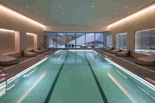
The pool and gym room face the lower-level courtyard with exterior doors.
The residential complex is composed of two structures: a 18-story north tower and a 13-story south tower that, “in reference to Cubism, are stitched together at the corner,” describes Shigematsu, whose design articulates a jagged edge. At the setback, exterior resident terraces overlook the intersection, with views to both the East and Hudson rivers. The precast panels, some as long as 27 feet on the north tower, are punched with square windows and have stepped interior edges. On the south tower, the façade articulates to form an undulating, slightly bulbous shape.
The south tower's façade undulates with articulating black precast concrete panels.
The site itself is a “zoning straitjacket,” says Paul Albano, a partner at SLCE, the project’s architect of record. In an “inspiring” way, “OMA challenged the assumptions to stretch the envelope as much as possible,” he continues. Thus a required interior light well becomes a central courtyard between the two towers with exterior doors to access the pool and gym. The pool is one of the most Zen-like spaces in the building, with soft lighting and large lounges; OMA designed the amenities in the building, while interior design firm INC Architecture & Design took charge of the 134 condominiums themselves—black kitchens, islands, and bathroom accent walls are all nods to the bold façade, notes INC partner Adam Rolston. (Other amenities in the complex include a Willy Wonka–esque screening room, whose orange-red tone shifts the longer one spends time in it; an indoor lounge with exterior terrace that juts out slightly over the lower court; a dining room and kitchen; a kids’ room decked out in Kinder Modern furniture; a bicycle room; and automated parking garage.) Looking up from the lower court, a series of triangular terraces off the living spaces extrude into the sky.
The screening room, designed by OMA.
Shigematsu chalks the project’s success in reimagining a restrictive site to the balance struck by his collaborators. His firm was specifically chosen for the project by developer Toll Brothers City Living, who, according to president David Von Spreckelsen, found appeal in an architect that had a creative reputation in the city but was seeking to explore a new typology. For this first, Shigematsu took a historical approach, researching nearby once-planned and existing Art Deco structures to design both contextually and contrastingly with its neighborhood. As he sums it up, the façade’s conjoined corner and double towers make up a project that “expresses the split identity of a site—halfway between Madison Square and Gramercy parks.” And to its early 20th-century adjacencies, it seems a dynamic but sensitive neighbor.
