As the saying goes, when you know, you know. While touring an open house with longtime clients in Los Angeles’s historic Hancock Park neighborhood, designer Jake Arnold knew they had stumbled upon a gem. Though it was in need of updating, the Tudor-style home with quirky details charmed the group. It was also a welcome change of pace compared to the clients’ single-story residence. Still, despite the stellar first impression, there were many more houses to be seen.
Two hours later, Arnold’s phone rang. The clients had put in an offer. “I was like, you’re joking,” Arnold recalls with a laugh.
For a designer, starting with a slate like this was ideal: The house had solid bones, the layout was in good shape, and there was no shortage of character. “The houses that have any kind of original features always excite me,” Arnold says.
Nonetheless, there was much to be done. The interiors were dark and dreary, and the mock Tudor features felt a bit too literal with overdone crown moldings and paneling. Arnold peeled back some of the fluff to let the home’s architecture shine. Overall, the directive could be described as straightforward: Simplify and refine.
Arnold also brought in furniture that matched the aesthetic of his clients. Instead of going with antiques to perfectly match the home’s architecture, midcentury and contemporary pieces were purchased to make the interiors feel up-to-date, but not too formal. He also worked in statement lighting fixtures by Apparatus and Rewire LA to “juxtapose between the more traditional aspects of the house.”
“We wanted it to go in a sophisticated direction, especially in the main spaces, but also still have the relaxed, California sensibility where everything is really usable,” Arnold explains.
The clients are relatively color-averse, preferring whites and neutrals. Under those directives, Arnold says, “I really think about textures and colors that have a richness to them yet still feel very livable.” Without the proper mix, the rooms could read flat and sterile.
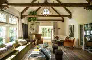
In the living room, he combined upholsteries—from mohair to sheepskin to velvet—to bring dimension and warmth into the space while avoiding bright colors and patterns. The walls in the majority of the house are painted with Farrow & Ball’s Dimity—a creamy off-white that can even read as slightly pink in certain lighting, and what Arnold calls an “automatic warm-up” shade. Elsewhere in the interior, Arnold stripped the black molding off the fireplace and found a beautiful limestone underneath. The ceiling beams—which were previously shiny, dark, wood—were lightened. For a luxe touch, he added unlacquered brass hardware to the windows and doors. The dark floors throughout were swapped with a more natural oak.
The kitchen’s update was also aided by a paint color switch. Arnold swathed the walls (and even between the ceiling beams) in a subtle green while painting the previously off-white cabinetry a slightly darker mossy shade. The wood beams and marble island further enhance the sophisticated palette.
One of the home’s most striking—and quintessentially Californian—spaces is the sunroom. With tiled floor and windows clad in textured Zak & Fox Roman shades, the palm-filled area is charming. To avoid seeming too patio-like, Arnold added cozy sheepskin chairs, ottomans, and an 18th-century credenza.
Even the most meticulous designers know it’s impossible to plan everything. On install day, Arnold moved the plants into the sunroom and tried something new: Hanging, adjacent to them, a painting of a palm tree that the client already had in storage. The on-the-nose artwork fit seamlessly, adding depth to the natural tropical backdrop. “That’s kind of where the magic happens that you don’t really plan,” Arnold says. “I always leave room for that.”

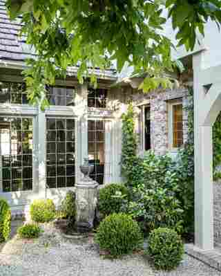
Los Angeles’s Hancock Park neighborhood is filled with historic homes, and this Tudor-style house fits right in. “The location is so great, and the house went from being sad and drab to actually looking like one of the best on the street,” Arnold says.

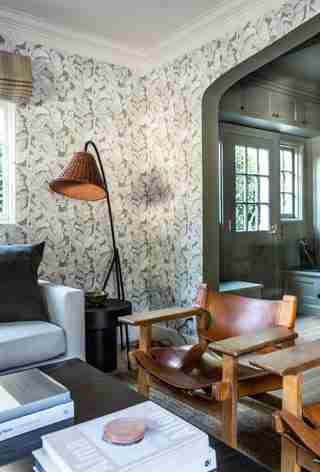
Just inside the house touches of green and natural materials can still be seen.

The living room was brightened up with a coat of Farrow & Ball Dimity paint on the walls and matching curtains. The room includes a custom sofa and stone coffee table, round coffee table from Obsolete, Green River Project stools, and a vintage chandelier.
Arnold stripped back the fireplace—which was covered with elaborate, black-painted moldings—and uncovered a simpler limestone surround underneath. The original beams were also stripped of a dark stain. The rug is from Woven Accents .
The custom table by Arnold in the dining room was also used in the clients’ previous home. The room features a vintage pendant light from Galerie Half , curtains in a Claremont fabric, candlesticks from Galerie Provenance , and vintage chairs.
An initially “strange” kitchen—which had nickel hardware throughout—got a total makeover. The kitchen now has Waterworks sittings, Rose Uniacke pendants, Van Cronenburg hardware, and walls painted in Farrow & Ball’s Lichen .
Now one of the most striking rooms in the home, the sunroom was previously in disrepair. (It also featured carpeted floors). Arnold added custom Zak & Fox Roman shades, Apparatus lighting, 18th-century credenza, and trees from The Tropics .
“This is the tiniest powder room, and we wanted to somehow make an impact in a tight space,” Arnold says. To do so, he chose a dark, moody palette. A custom marble sink with an attached mirror, The Water Monopoly toilet, and Portola Cobra wall paint complete the powder room.
Special details—like the arched doorway leading into the primary bedroom—attracted the clients to the home. The bedroom features a Rewire chandelier and a Lawrence of La Brea rug. The walls are painted in Farrow & Ball’s Broccoli Brown .
