
Let’s talk about purple. Pink has gotten a bit of a chic and mature facelift as of late, but purple still retains all those childish, girly, princessy associations — all things we think of as unsophisticated. When color authority Pantone chose Ultra Violet as their color of the year , the reaction, from a lot of corners, was that the idea of using purple (particularly such a bright shade of it) in any large amount in interiors was just absurd. Is there a way to make bright purple work? Or is this a color that’s just always going to seem a little bit gauche? Let’s take a look.
This deep, classic purple, seen in a room from Casa Vogue , is definitely a lot (especially when paired with those velvet curtains). While I understand that this room may not be for all tastes, it gets a thumbs-up from me for creating a color experience that’s committed, immersive, and yet somehow not cartoonish. Less princess, more queen.
There’s crayon-box purple and then there’s plum, or aubergine, or whatever you prefer to call it — a deep (and a bit reddish) shade of purple that somehow reads a bit more grown-up than its bluer counterparts. When it fills a whole room, as in this space from Domino , it’s still quite a strong statement, but it’s a bit more nutty professor (in a good way) than grown-up Barbie. It also, unexpectedly, coordinates well with caramel-toned leather.
Pink, purple, and gold are as princessy a combo as you can get — but in this Paris apartment by Crosby Studios (also seen at the lead of this post), they come together in a minimal and even modern way.
If your tastes tend more toward the bluer, dreamier end of the purple spectrum, there’s still hope. The column in this room from Pelle Bergstrom , via Apartment Therapy , is distinctly highlighter-colored, but the white of the surrounding room (and the more staid deep purple of the neighboring sofa) balances it neatly.
Purple in a kitchen might seem odd or garish, until you see this kitchen from My Domaine , which unexpectedly seems just right. The wood countertop and shelving really balances out the jolt of color.
You might not think it, but Ultra Violet, a very bold color, and dusty pink, which tends to be a bit retiring, can be a very nice combo, as seen in this composition from Dimore Gallery . The key: keep the bolder color as the accent.
That same thinking prevails in this room by Wesley Moon , where a very boldly colored purple bed makes a great impact, but doesn’t overwhelm the space, thanks to the light blue background.
Layering purples on purples creates a whole suite of new possibilities. Deep purple accents paired with lavender walls, in this space from Domino , feel eclectic and original.
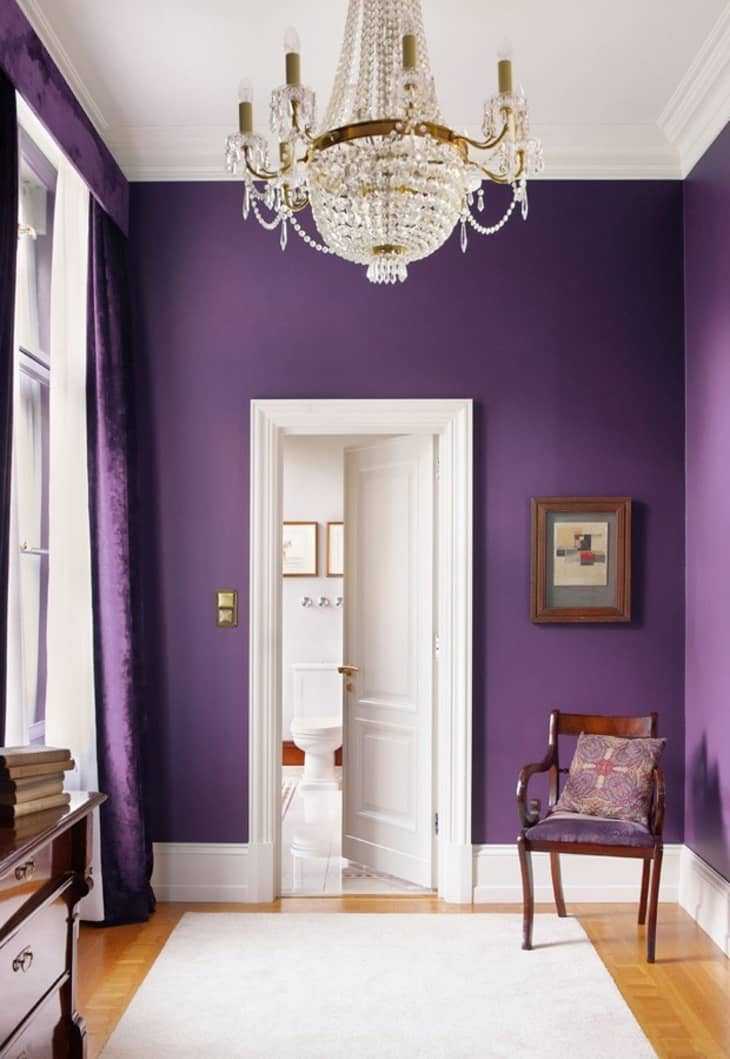
Purple creates a backdrop for a really quite sophisticated room in this image from Domino . The takeaway? A deep purple like this is always going to be a bold statement, so limit the other colors used to neutrals.
I think plum really comes to fruition in this room from Elle Decoration , paired with a rich marine blue. It’s an unexpected but really lovely combination, and also proof that purple has a lot of sides, and can be very sophisticated and surprising. Look, you may still not love it — but that’s okay. There’s a unique richness to purple, and one that can, in the right circumstances, really shine.