Even before they embarked on the renovation of a 3,000-square-foot loft overlooking New York’s Union Square, Max Worrell and Jejon Yeung, co-principals of Brooklyn architecture studio Worrell Yeung , and Jean Lin—of the cooperative gallery, design studio, and strategy firm Colony —knew they wanted the interplay of its fundamental geometries to help fuel their design. The loft in question occupies the entire third floor of a triangular, Renaissance Revival-style building designed in 1899 by the German architect Robert Maynicke—a pioneer of these types of modern spaces.
A custom metal screen-slash-bookcase near the home’s front door draws from the surrounding streets, while a curved soffit introduces circular elements that punctuate the entire scheme. Wide-plank white oak floorboards run perpendicular to the exterior roadways, and simultaneously unite the different zones inside the home.
“The subtle shifts and angles were created as a nod to the importance of the New York grid and the dynamic disruption of Broadway,” Yeung says. His collaboration with Lin yielded an interior that transformed the loft into an elegant home which can comfortably pivot from tranquil refuge to lively gathering place. Often that means recitals, as one of the homeowners is a concert violinist.

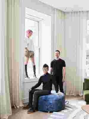
Jean Lin, Jejon Yeung, and Max Worrell, photographed inside the home.
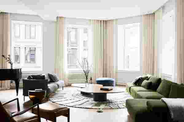
Lin adds that the 14 northwest facing windows helped infuse the apartment with the type of loft-like aesthetic that the designers were after. “The goal from the beginning was to create layers of texture and comfort, and also to embrace the open nature of the space,” says Lin, who trained as a fashion designer before founding Colony. “Equally important to us was that the overall architecture maintains a feeling of intimacy.”
There were nonetheless additional challenges from the outset. “The apartment wasn’t in terrible shape, but certainly wasn’t inspiring,” says Worrell, a Yale-trained architect known for creating inventive, modern designs. “We really wanted to explore strategies that emphasized the distinct nature of the loft, expressing original elements.” Notably, the previous owners had stripped the home of much of its original detail.
Highlighting those elements meant replacing the windows with landmark-approved, historically accurate wood apertures that Worrell says maximize daylight and improve acoustic performance. Window trims were also recreated with more modern, streamlined casing, while stately plaster columns and beams were rehabilitated to their original condition.


Buy now for unlimited access and all of the benefits that only members get to experience.
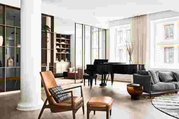
The entryway leads directly to the home’s interconnected living area—an open, communal space that is part den, part dining room, and part kitchen. It includes dark-stained ash casework and a low-slung antique gray marble hearth and bench. It also includes a home workstation that can be closed off by sliding metal and glass doors. Nevertheless, a Mason & Hamlin grand piano is the undisputed focal point of this space. (Interestingly, the apartment’s connection to music precedes its current inhabitant, as the previous owner and original piano owner allowed musicians from Lincoln Center to use the space for rehearsals.)
Not far away, a long hallway leads to the home’s private rooms, which include a primary bedroom crafted from hand-trowel plaster and paneled white oak that the architects say offers privacy and separation from the connected bathroom. The second bedroom serves a triple function as a guest suite, office, and rehearsal space for the homeowner, with three large doors that close to acoustically separate the room from the other areas of the apartment.
“The idea was to create an interior landscape of new interconnected spaces defined by carefully curated material elements,” Worrell says. “I think we ultimately found success through those ideas.”
