Marlien Rentmeester, a devout New Yorker, figured if she were going to live in L.A, it should be by the beach. So when she and her husband, John Phelps, a tech entrepreneur, relocated to California, they ultimately settled into a 1950s Cape Cod–style cottage in the Pacific Palisades, a seaside enclave with a “Hamptons vibe,” as she describes it. The only problem: The house was anything but beachy inside. “It had an old-fashioned layout, with a bunch of smaller rooms, rather than great open spaces,” she explains. The decor—an elaborate mishmash of prints, colors, and Regency-style pieces that had suited her sensibilities back in Manhattan—didn’t help.
“It was very formal and ladylike,” says interior designer Alexander Reid, whom Rentmeester tasked with giving the house a major refresh. The two had met a few years earlier when he was brought on by One Kings Lane to update her home office, where she edits her fashion blog Le Catch. The result, a sleek, stylish mix of high and low, instantly won her over. “He just got me,” says Rentmeester. “I asked him to do the rest of the house.”

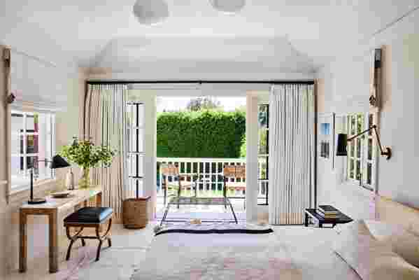
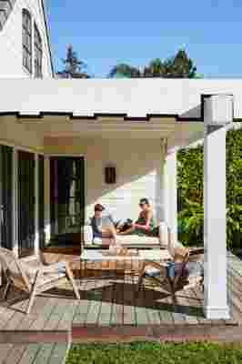
Their bedroom was always bright and airy, but it had a lot of busy prints in it. Reid swapped the Manuel Canovas handprinted drapes for crisp linen ones, and added a vintage dhurrie rug. The “easy, breezy” deck chairs are from Serena & Lily.
Reid, who is known for contrasting styles and periods to create an interesting tension, was eager to give the traditional house an entirely modern look. “Marlien’s from New York and has such good style and taste, I thought, Why don’t we make it a cool New York loft—with a Cali feel?” he recalls. To that end, he stripped it clean, removing all the ornate lighting, fussy window treatments, and any furniture that couldn’t be recast in a more minimal manner. He then went to work on the dark oak floors, giving them a heavy coating of high-gloss white paint. To brighten the house even further, he knocked holes in the walls, adding French doors in the dining area and a window in what had been a rather dark and unwelcoming front entryway. “That was a game changer,” says Rentemester.
The ultimate resource for design industry professionals, brought to you by the editors of Architectural Digest

When it came to furnishing the house, Reid took a similarly light approach, bringing in stylish, albeit accessible, midcentury-style pieces, some of them custom-made. “This is a beach house and they have two young boys—I didn’t want the furniture to be so precious,” he explains. In the kitchen, Josef Hoffmann side chairs surround an Eero Saarinen table. In the den, a minimalist, custom-designed sofa made of raw oak serves as a neutral centerpiece for the colorful art. For the “game room,” which previously had been a rather dark and prim living room and dining area that Rentmeester and her husband estimate they had hung out in it four times in past 11 years, Reid chose a reproduction of a curved Vladmir Kagan sofa, and a pair of armchairs in the style of Pierre Jeanneret, painted a crisp black. “I don’t hate copies—I think they’re fun,” he says. “And who wants a $30,000 chair beside a ping-pong table?” Certainly not Rentmeester. “We’re laid-back entertainers and very family-oriented,” she says. “This house, now, feels very us. ”

